CALLAWAY GOLF PRE-OWNED
Homepage Restructure
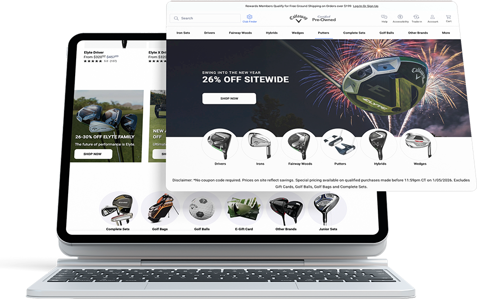
Oct 2024 - Dec 2024TLDR: During the CMS migration planning, I led a complete restructure of the homepage layout and offers to address hidden shopping options, long scrolling, and broken user flows. The goal is to transform the site into a user-friendly, modern marketplace that aligns with both customer needs and business goals.
Involvement: Design Lead | UX Research | Content Restructuring | UI Design | Project Management | A/B Test Setup | Partial Front-End Development
-33.9%
Bounce Rate
-28.2%
Exit Rate
-42.9%
Page Height
 *Major updates were implemented in December 2024, with the remaining work scheduled for completion during the CMS migration in June 2025.
1. Overview
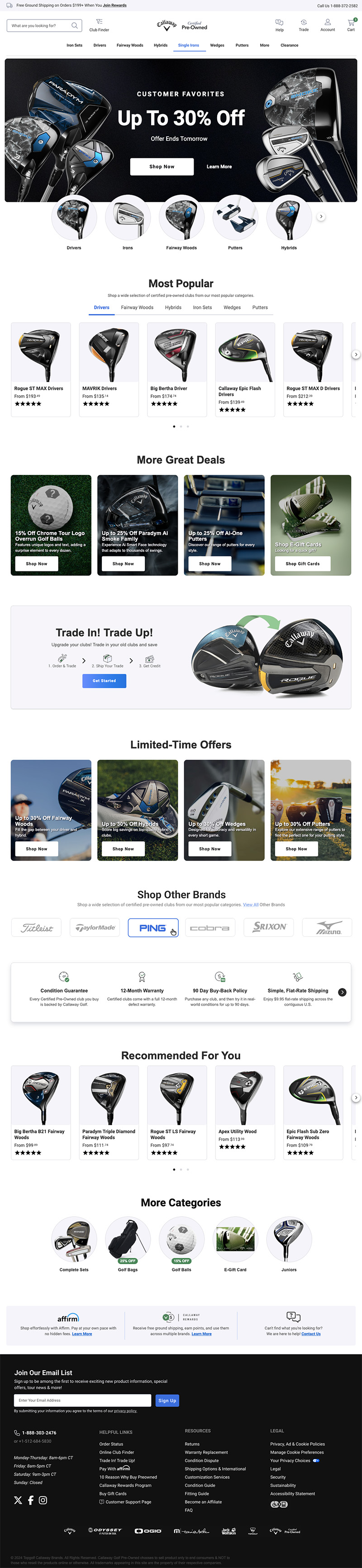
The Callaway Preowned website had become a confusing and outdated shopping experience. As the design lead, I was tasked with the challenge to redesign the homepage and improve the user experience. This project aligned with our migration to a new CMS, providing an opportunity to address issues, uncover lost sales, and enhance navigation. I led the project from start to finish, working closely with stakeholders and other designers within a tight three-month timeline to plan, prove restructure, test and hand off to CMS migration contractors.
Project Goals
- Positioning CGPO as a marketplace rather than a brand.
- Build trust and credibility with updated designs.
- Educate customers about tools and features.
- Rearranging content based on engagement metrics aimed to improve visibility and guide users toward interacting with key features more effectively.
- Unveil hidden opportunities.
- Provide clear, multiple shopping options to enhance the customer experience.
Hypothesis
- Trust-building sections were hidden or non-existent.
- Simplifying the structure would improve navigation.
- Improved navigation and a clearer path to products would increase conversions.
- Exposing main and secondary categories, player types, brands, and search options is expected to enhance customer engagement with the homepage.
 *The old homepage lacked a primary visual category selector, clear hierarchy, and organized content, with key elements like tabbed recommendations placed too low for impact.
2. Research
This process involved evaluating our existing offerings and collaborating with the merchandising team to assess the value of our features and determine competitive opportunities. By comparing our site to four main competitors, I analyzed their structures, trust signals, value-added features, category displays, and shopping options. The findings provided a clear view of our strengths and areas needing improvement.
Competitor Analysis
I examined their category structures, trust-building features, and unique value propositions to identify where we could improve. Trust signals, such as warranties, condition descriptions, and customer reviews, played a significant role in this evaluation. We used these insights to refine our approach and ensure we provided equivalent or better features.
| Website | CGPO | Golf Avenue | Next Round Golf | Global Golf | Second Swing |
|---|---|---|---|---|---|
| Visual Category Selector | Yes | Yes | Yes | No | Text Links |
| Product Recommendations | Yes | Yes | Yes | Yes | Yes |
| Secondary Promos Per Viewport | Two | Three | None | Four | Six |
| Shop by Brand | Hidden | Yes | Navigation | Yes | Yes |
| Trade Program | Yes | Yes | Yes | Yes | Yes |
| Site Experience Reviews | No | Yes | Yes | No | Yes |
| About Us or Our Process | No | Yes | Yes | No | No |
| Why Buy & Perks | Yes | No | No | Yes | Yes |
| Access to Customer Support | Easy | Easy | Hard | Okay | Hard |
| Free Shipping Offer | $199+ | $199+ | $300+ | $99+ | No |
| Rewards | Yes | No | No | Yes | No |
| Email Sign-Up | $500 Gift Card | 20% Off / Spend $200 | 10% Off | No Offer | No Offer |
| Blog & Resources | No | Yes | Yes | Yes | Yes |
| Club Finder or Online Tools | No | Yes | No | No | Yes |
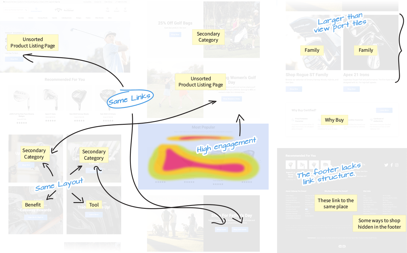
Heat Maps and Analytics
Using Content Square heat maps and analytics, I prioritized areas for improvement based on user interactions. By analyzing these insights, we could refine page layouts, improve navigation flows, and focus on the features that mattered most to our customers.
User Feedback Analysis
I collaborated with the Consumer Insights Manager to access Qualtrics data. From a pool of 330 customer surveys, we identified recurring issues with the website, including navigation challenges, insufficient filter options, and unclear product condition descriptions. These insights shaped our redesign strategy, helping us address key usability concerns and improve the overall shopping experience.
Baymard Institute
I leveraged insights from the Baymard Institute as a resource for best practices and benchmarking to ensure the reorganization aligned with industry standards. Their research provided actionable guidelines on navigation, e-commerce usability, and content organization, helping to refine our approach and deliver a more user-centric experience.
3. Findings
I facilitated strategy workshops, combining research findings and team brainstorming to collaboratively identify pain points and prioritize improvements. These sessions led to the development of the three pillars, forming the foundation of a strategy that balanced functionality and clarity.
Real Customer Comments
I wish there was a section where I could input my skill level and preferences to get personalized recommendations.
The site was cumbersome and didn’t really work on my phone.
I would love a feature where I could input my handicap and receive personalized recommendations.
When searching for a set of clubs, you have to scroll forever to find the correct combination.
I found the site to be not user friendly. The prices show one thing but then you go to add to your cart and the cost of clubs changes.
Sometimes it’s awkward to switch between categories e.g., from irons to drivers
If a photo of each club was available, it would be helpful to determine true condition of the club.
I found it confusing when searching for iron sets and the website separates them by brand, making it hard to focus on specific specifications like loft or lie angle
4. Strategy
The strategy for the redesign was rooted in a customer-first approach, focusing on aligning user needs with actionable insights to create an intuitive and engaging shopping experience. By identifying key pain points and opportunities, the strategy revolved around defining clear shopping paths, structuring information effectively, and developing a homepage framework that balanced functionality and aesthetics.
Information Re-architecture
To ensure clarity and usability, I developed a robust information structure that categorized content into specific buckets. These included guided browsing paths, secondary offersm, deciison support (guides tools), and decision-support tools Organizing content in this way provided a logical flow that made it easier for customers to navigate and find the information they needed.
Shopping Options
By Club Type
By Player Type *
By Brand *
By Family *
By Putter Shape *
Advanced Filters
Best Sellers
Complete Sets *
Secondary Offers
Accessories *
Gift Cards
Sale/Clearance *
Shafts
Trade Up Program
Customer Trust & Perks Offers
Easy Payments - Affirm
Email Signup
Reason To Buy
Rewards
Site Review fiber_new
Our Process fiber_new
Decision Guides and Tools
Buying Guides fiber_new
Condition Guide *
Fitting Guide *
Assistant Finder fiber_new
Leverage Other Test Results
Outside of using heatmaps to relocate certain elements based on their high engagement and Baymard's best practices, we incorporated insights from tests conducted on our other sites that were proven to improve performance.
Visual Main Categories, effective below the hero section (tested on ogio.com).
+4.73% CTR
and +5.94% CTR on Mobile

Large 2 tiles vs. 4 tiles per row, optimizing visibility and engagement (tested on CallawayGolf.com).
+20% CTR
and +4.23% ATC

Tabbed experience redesign with more purchase options as a final card (tested on the Preowned site).
+2.97% ATC
and +1.28% higher engagement

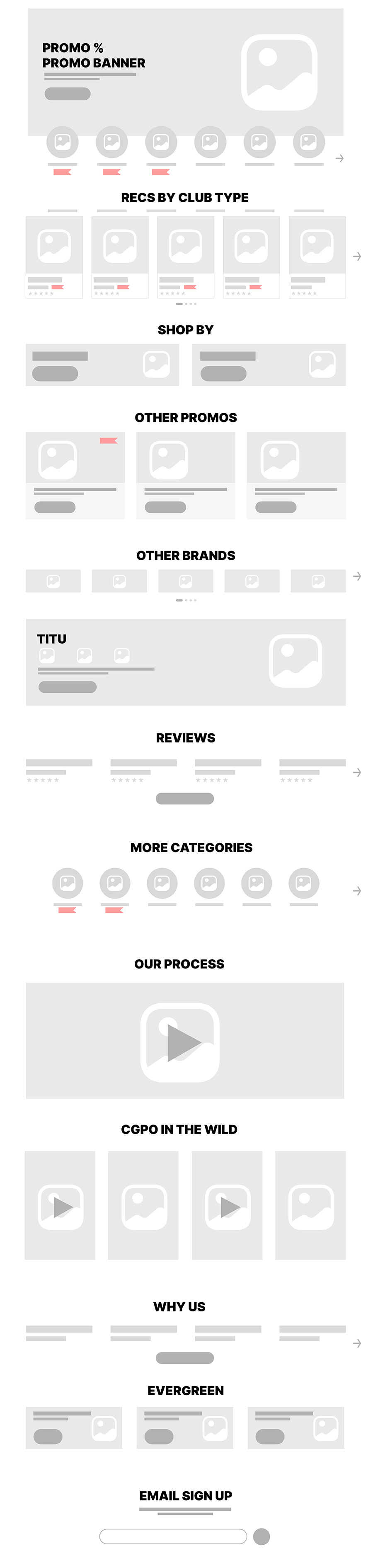
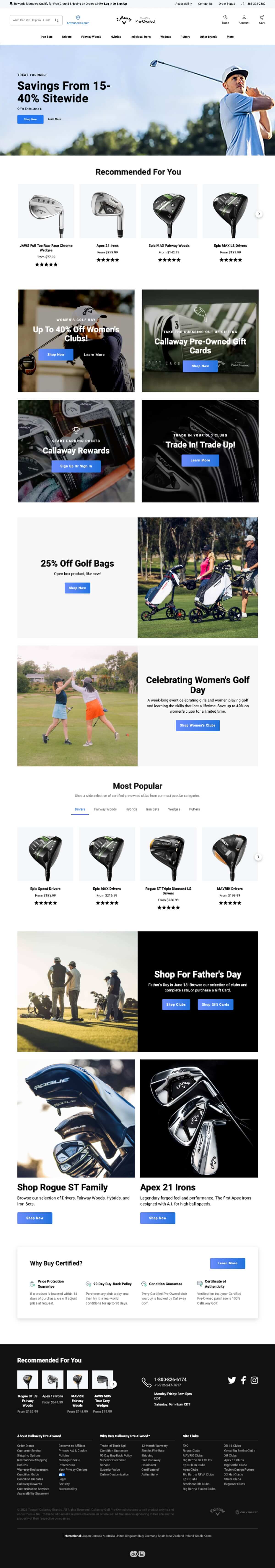
Homepage Framework
The new proposed homepage framework included visually engaging categories beneath the hero section, prominent tabbed recommendations, and a clean, intuitive layout that highlighted tools and benefits.
I began by creating low-fidelity wireframes that mapped out the structure and flow of the homepage. These wireframes became the foundation for an iterative development process, allowing stakeholders to provide feedback and refine the design through multiple rounds of internal validation.

5. Prototype
I rallied my team to develop high-fidelity prototypes that brought our proposed restructure to life. Once prototypes were approved, we met one more time with all stakeholders to finalize a detailed roadmap and plan the necessary tests that my team and I would manage.
2024
2025
6. Results
We launched the new homepage updates to allow merchandisers to test, gather data, and validate usability before handing off to the CMS migration contractors in the first week of January. Early results showed increased engagement, reduced bounce rates, and a streamlined user journey.
-33.9%
Bounce Rate
-28.2%
Exit Rate
+9.98%
Time Spent
-42.9%
Page Height
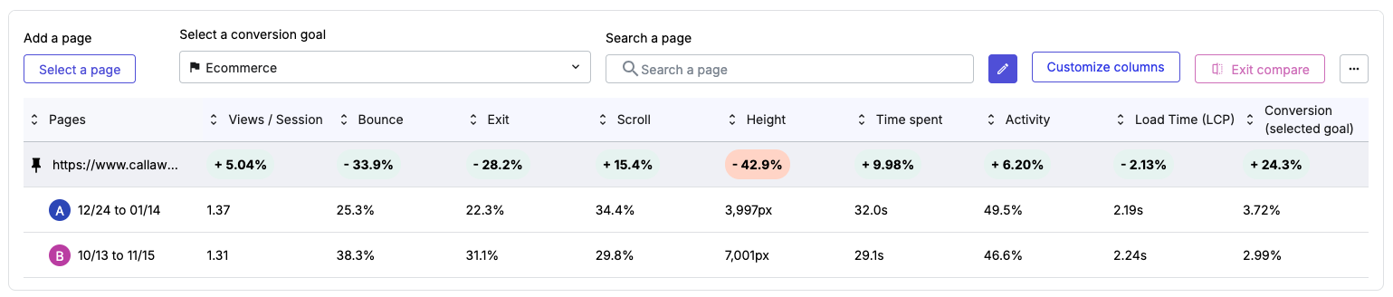 *The performance of the new design (pushed live on 12/24) was compared against metrics from a similar off-season period (pre-Black Friday). This approach ensured a fair evaluation by accounting for consistent traffic and user behavior patterns outside of peak shopping seasons.
Deliverables and Execution
The deliverables included a fully redesigned homepage, a clear content structure, and interactive wirefranes used for stakeholder approval. I am facilitating A-B testing to validate the placement, content, and formatting of specific modules. The prototype files have been handed off to the CMS migration contractors, along with a live homepage to serve as a reference.
Future Tests
- Evaluate the placement of the new modules to determine optimal positioning.
- Run a test comparing engagement between "By Brand" and "By Family" shopping paths
- Test Promo Tiles:
- Desktop: Compare 2 rows of 4 tiles vs. 1 row with 8 sliding tiles.
- Mobile: Compare 4 tiles in a 2x2 grid vs. a slider format.
Lessons and Reflections
While the project was a success, tighter timelines and contractor dependencies limited our ability to incorporate user testing. Despite these constraints, the project showcased exceptional teamwork and collaboration, as we worked together to overcome challenges and deliver a strong outcome.
🏌️How's that for a hole-in-one?
If you're looking to achieve similar results and drive impactful design solutions, contact me, and let's tee off your next project together!