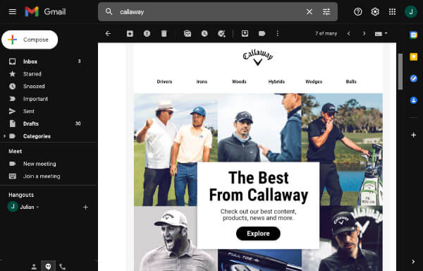
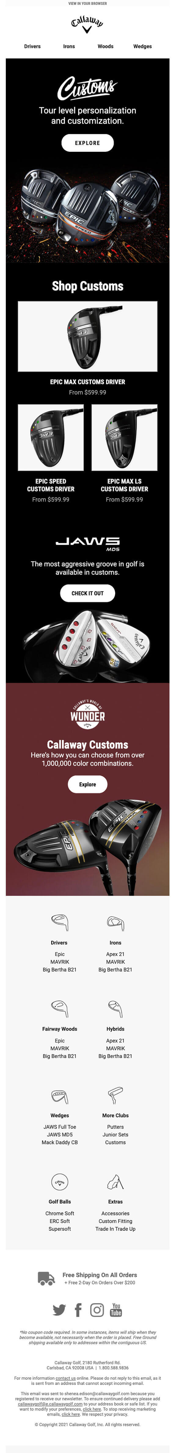
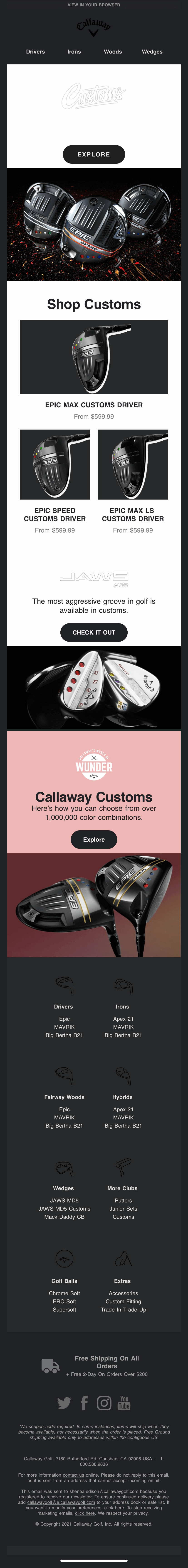
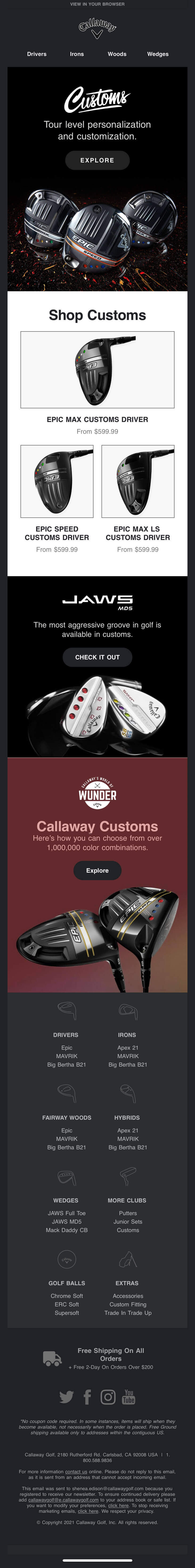
Email Redesign and Dev

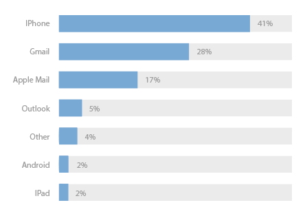
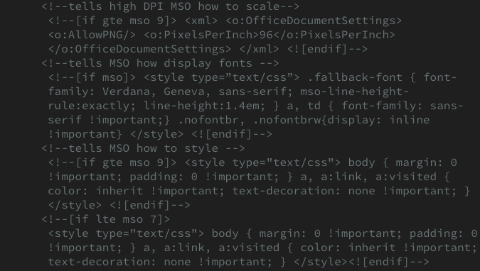
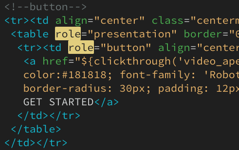
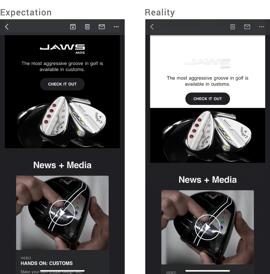
TLDR: Email experience was fragmented, non-responsive, and hard to maintain. Delivery issues included lack of ADA compliance, Dark Mode support, and large file sizes causing emails to crop in Gmail.

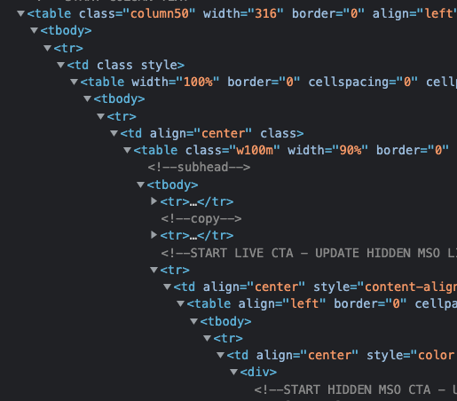
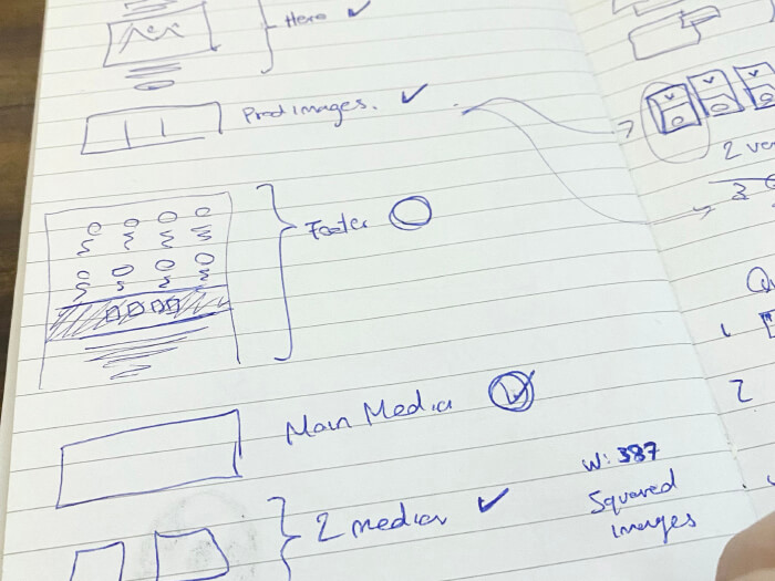
Actions Taken: Proposed redesign, conducted UX/UI research, and built responsive, reusable templates. Ensured accessibility and fixed Dark Mode issues.

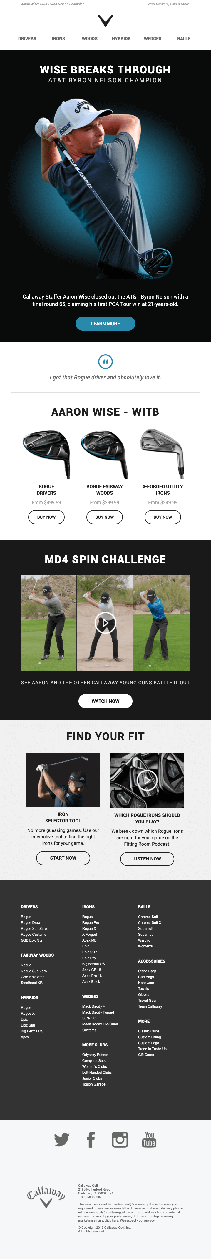
Results: 20% more emails sent in the first year. Reduced file size by 25%, cut scrolling by 40%. Improved mobile experience and development efficiency by 50%.

View DetailsSkip To The ResultsView Live Email

Fragmented user experience:

Most of users engage with our emails on mobile yet their experience wasn’t cohesive with our brand or responsive. 

  • Various long scrolls on every email. 
  • Hard to maintain code

Delivery Challenges:

Lack of ADA and Dark Mode support created delivery challenges for a portion of our email users list.

  • Designers & devs were required to pull old sections from past emails, resulting in design inconsistency, bugs and time inefficiency due to constant code editing.
  • Very large files caused email to crop on Gmail (due to their html size limit 125 kb)

What I did:

Strategized Proposal for Marketing Executives on the need of a redesign 

  • User Research, UX & UI Design, Prototyping
  • Created reusable templates, Responsiveness, Clean unnecessary code (to reduce size)
  • Ensure Accessibility & correct Dark Mode delivery
  • Redesign project implementation and launch

Challenges:

  • Gmail & Microsoft forcing fonts and quirky css rules. Outlook ignores a lot of classes required to keep email clean by forcing you to inline everything. Gmail is hard to debug due to their strict CSS guidelines, where the smallest error could break the entire email.

Accessibility Upgrades:

  • Added role="presentation" presentation to every table
  • Implemented the use of live text in almost every section
  • Added relevant descriptions to images with the alt="text"
  • Added the role="button" to every a tag
  • Contrast tests for every color
  • Layout and readability

Dark Mode:

Gmail app in dark mode does a full invert of colors, yet it doesn’t respect contrast. To correct the issue and provide a consistent email experience, I used blending modes and linear- gradients. This resulted in Dark Mode working properly for our entire user email list and use of blending modes and linear- gradients in all emails (transactional & automated)

Results

  • After redesign and launch of reusable templates, designers & devs team was able to send 20% more emails the first Year.
  • Created a library of bug free, reusable snippets. Cutting dev and delivery time for more than 50%.
  • Create a unified template that included standard reusable sections plus extra sections to set up team for scalability
  • Improved layout, readability and overall mobile experience.

The Old 2018(Browser) 

Average file size for a 6 Section email 108KB

The New 2021 (Browser)

25% smaller - Average File Size for a 6 Section email 82KB

The Old (Mobile) 

On a 375px wide device the length of the email was 5832px

The New (Mobile)

Reduced scrolling by 40% - On a 375px wide device the length of the email is 3509px

Light Mode
- Mail App

The nicest of all. No bugs and it renders other fonts

Dark Mode Default
- Gmail App 

Full Invert. Changed backgrounds and ruined contras, logos and readability.

Dark Mode Optimized
- Gmail App

All text is readable and full control over background colors.