CALLAWAY GOLF
Trade Experience Upgrade
Dec 2023 - Jan 2024TLDR: Redesigned the "Trade-In Trade-Up" experience to simplify user flows, align with user needs, and enhance customer engagement. The project redefined how customers evaluate and exchange equipment, preparing it for future scalability.
Involvement: User Flow Optimization | Competitor Analysis | Prototyping | Visual Design Refresh | Development Handoff
2x
Faster
1.5 Mo
Sketch to Hand Off
From 7 to 0
Page Re-loads
 *Partially live. The full experience, including the search keyword feature, is set to launch in 2025.
1. Overview
The Trade-In Trade-Up experience had confusing navigation, an outdated design, slow performance, and unclear upgrade paths, causing user frustration and low conversions. I was tasked with leading the redesign, making it the first major upgrade during our CMS migration, with a focus on simplifying user flows and improving usability.
Project Goals
- Enhance user flow clarity by simplifying navigation and minimizing disruptions.
- Improve accessibility to ensure a seamless and intuitive experience for all users.
- Increase interactivity with clickable images, product names, and clear selection indicators.
- Provide better feedback with confirmation messages and visual cues for actions like adding items to the cart.
- Design and deliver the redesigned experience within six weeks, ensuring it aligns with the CMS migration timeline and is ready for implementation and user testing.
Known Pain Points
- Lack of accessibility and clear feedback when interacting with the cart or item selection.
- Complex navigation requiring multiple steps to start the trade-in process.
- Disrupted user flow due to frequent page reloads after selections.
- Limited interactivity, with non-clickable images and product names.
- No confirmation messages or visual clarity for added items, leading to user confusion.
2. Research
I conducted extensive research into leading trade-in programs, analyzing industry standards, user experiences, and innovative approaches. This included a comprehensive competitor analysis, evaluating how top programs leverage real-time search, step-by-step guides, and clear call-to-actions with confirmation messages.
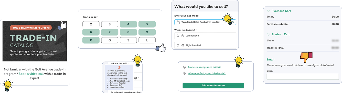 *Competitor Research findings: Key insights included tooltip trade bonus callouts, easy access to customer support, a short iron configuration selector, and keyword search functionality. While effective, I wasn’t a fan of practices like forcing users to provide an email to reveal pricing, as it adds unnecessary friction to the user experience.
3. Findings
Working along side the XX manager and throguh assumpiton and research finding I was able to categorize findings into three main problem areas, each of which informed the design direction and strategy.
Real Customer Comments
The trade-in features were not easy to use requiring me to call in to make the order/trade.
Better description of Trade In process...easier to understand.
I still find trade-in a bit confusing
The trade in website is a bit confusing when using it at the same time that a purchase is made
The clubs trade in program is a little confusing on the website and the clubs I have don’t even appear on the website.
Not to clear on how the 50% trade in allowance program works I have not been custom fitted in the past
I have trouble with the trade in / trade up page
Try to make trading in clubs a little easier
4. Strategy
What would make this intuitive? What would eliminate frustration? With these questions guiding me, I focused on simplifying navigation, clarifying interactions, and ensuring users always felt in control. To achieve this, I worked closely with the Digital Manager to align the design with business goals and address known customer pain points gathered from site experience feedback.
Design Flows Brainstorming
To simplify the process, I introduced popup modals accessible from the cart and footer, reducing unnecessary navigation. I suggested eliminating page reloads by using JSON calls for seamless updates and added a search feature to help users quickly locate products, skipping multiple steps. These changes prioritized speed, clarity, and a smoother experience.

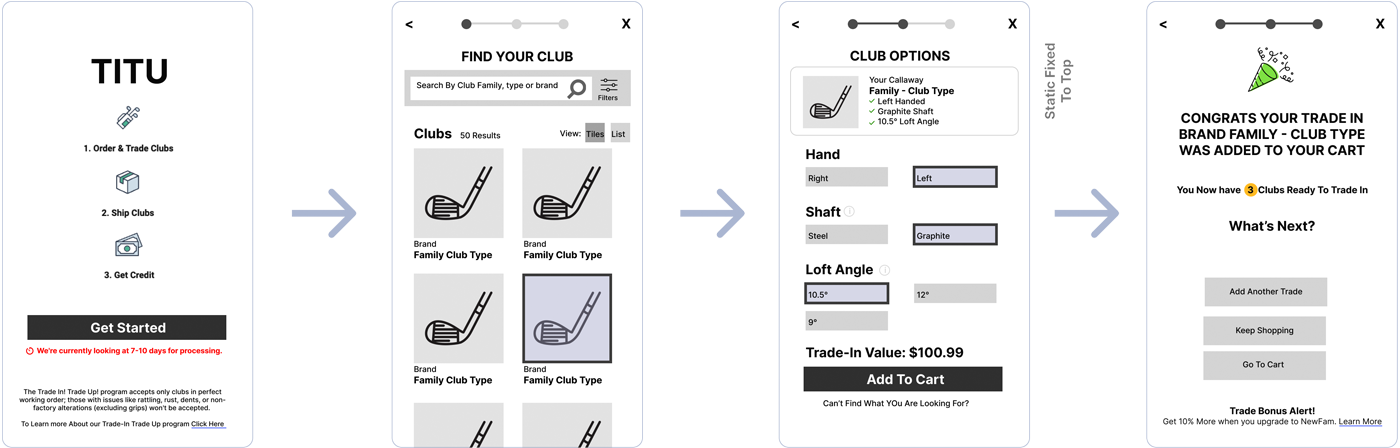
Low-Fidelity Wireframes
Feedback from stakeholders, including the Digital Manager and UX Data Analyst, validated the design before handing it off to contractors for development.
5. Prototype
To finalize the details of the redesign, I shared the high-fidelity prototypes with the designers, email marketing team, and merchandisers during a dedicated meeting. This collaborative session allowed us to test the prototypes, gather feedback, and refine the final details before handing off to the development team.
Key features included dynamic data updates, interactive full-card elements, and optimized workflows designed to minimize friction. Usability testing demonstrated significant improvements, including increased user satisfaction, fewer drop-offs, and a process nearly twice as fast as the previous version.
Live Prototype 👉
6. Results
The videos below showcase the improved user journey, highlighting faster navigation, simplified workflows, and dynamic features that enhance engagement. The new design reflects a user-first approach, solving previous pain points and delivering a more efficient, satisfying trade-in process.
2x
Faster
1.5 Months
Sketch to Hand Off
From 7 to 0
Page Re-loads
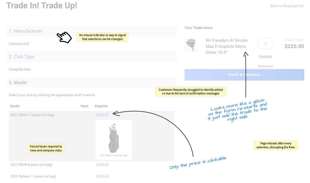
The Old ~60s*
⚠️ Lack of accessibility and clear direction when items are clicked or added to the cart.
⚠️ 0:03 Multiple pages to navigate before starting the trade-in process.
⚠️ 0:17 Page reloads after every selection, disrupting the flow.
⚠️ 0:24 No mouse indicator or way to signal that selections can be changed.
⚠️ 0:40 Forced hover required to view and compare clubs.
⚠️ 0:45 Only the price is clickable—images and product names are not interactive.
⚠️ 0:47 Customers frequently struggled to identify added items due to the lack of confirmation messages; instead, page reloads moved the item to the right with no visual clarity.
*A 1-minute completion time is optimistic and assumes the user is already familiar with the process.
The New ~30s
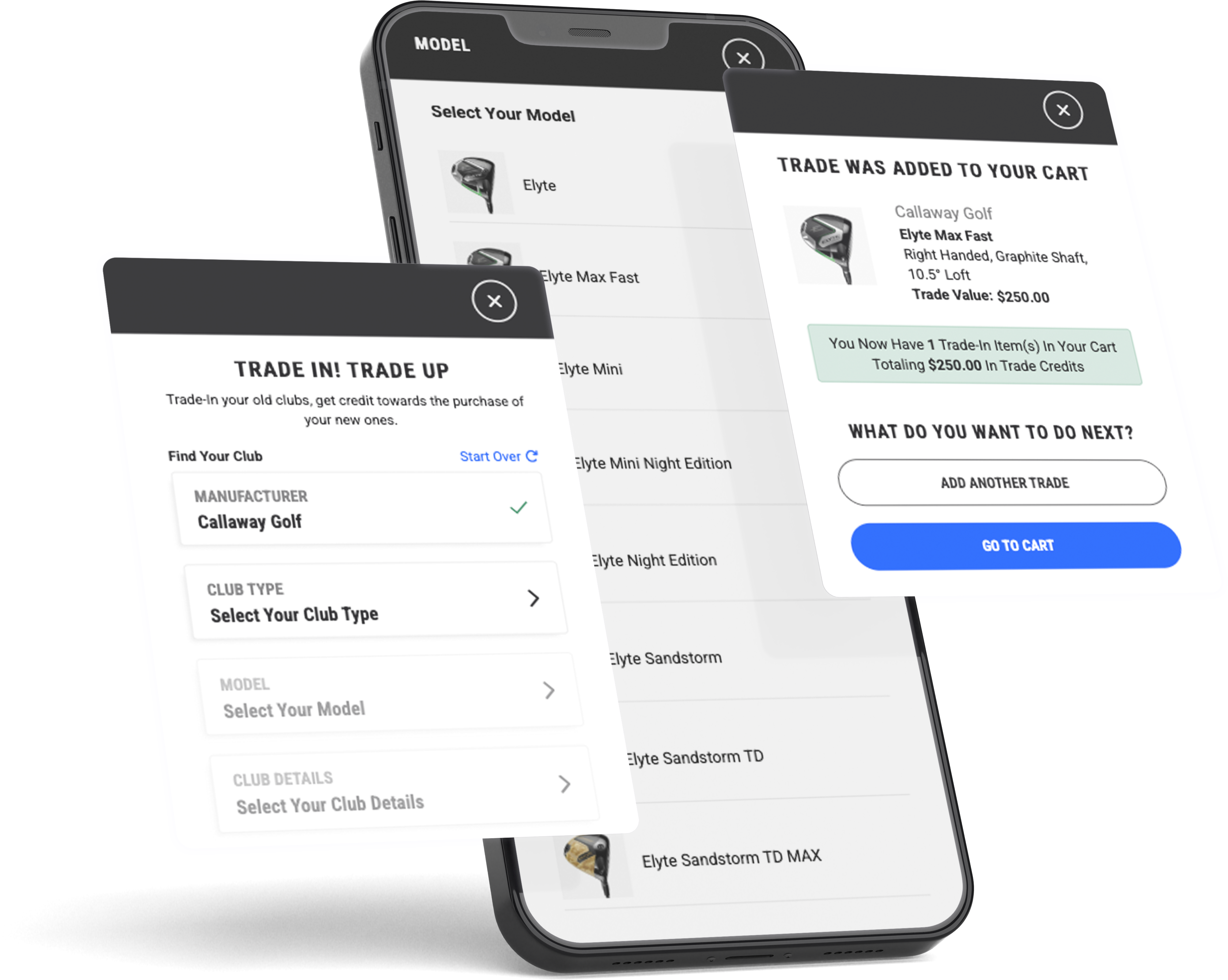
✅ Visual cues, hierarchy, and indicators enhance navigation.
✅ 0:03 Quick modal explaining how it works, making it easy to start the trade-in process.
✅ 0:06 Seamless interaction—no page reloads. Data updates dynamically on the right panel.
✅ 0:14 Easy to edit selections.
✅ 0:14 Full card interactivity
✅ 0:20 Product imagery added, allowing users to identify their clubs faster.
✅ 0:26 Easy to start over if needed
✅ 0:31 A confirmation message and next steps are displayed clearly after each action
Deliverables and Execution
The project deliverables included a comprehensive Figma file with detailed notes and a live prototype, along with desktop versions to guide development. The redesigned experience officially launched in the summer of 2024.
Pending Updates
While most features were successfully implemented in the initial launch, some updates didn’t make it into v1. These are expected to roll out with the CGPO migration in May 2025 and include:
- Keyword search capability
- Enhanced trade messaging and calculations for promotional periods
- Tooltips for product specifications
- Simplified shaft/flex and club configuration for irons
Lessons and Reflections
Despite challenges with integration and limited post-launch data, the project resulted in a dramatic reduction in user complaints, dropping from around 10 per month to nearly none. This process also provided valuable insights into product configuration and best practices for simplifying complex workflows.
🏌️How's that for a hole-in-one?
If you're looking to achieve similar results and drive impactful design solutions, contact me, and let's tee off your next project together!