CALLAWAY GOLF PRE-OWNED
Club Finder UX Refresh and Conversion Lift
Sep 2024TLDR: I improved our Club Finder tool (previously known as Advanced Search) by upgrading the UX and UI, which led to a +16.20% lift in ATC conversion on desktop and a +7.69% lift in overall order conversion on desktop.
Involvement: Design Lead | UX Research | UI Design | Prototyping | Dynamic Yield A/B Test Setup | Implementation (DY code) | Handoff to Front-End
+16.20
ATC Conversion (Desktop)
+7.69
Overall Order Conversion (Desktop)
+9.61
Add to Cart Rate (Mobile)
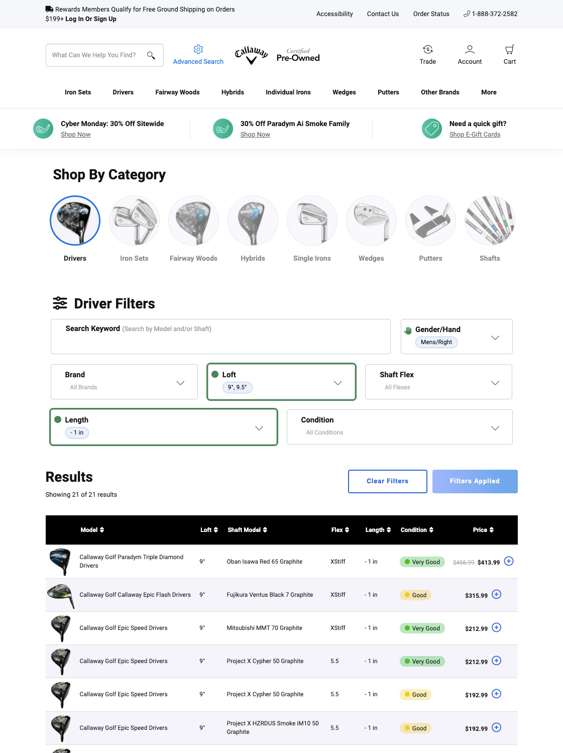
1. Overview
This project was one of the early steps in improving a key shopping tool before our CMS migration work. I was asked to improve Club Finder (previously Advanced Search) because the people who use it tend to spend more, but the experience was holding them back.
The grid was hard to scan, product previews were missing, and the filters felt overwhelming unless you already knew exactly what you were doing. Success meant making the tool more visual, easier to use, and easier to understand, so shoppers could confidently filter products and add items to cart.
I brainstormed with my UX Manager first, then I brought a few options to review with the Senior Director of Growth and E-commerce, and we decided what to test first based on impact and speed.
Club Finder Users
- Most advanced golfers who know exactly what they want tend to shop using filters like these. They often spend more, but the conversion rate was still lower than expected.
 *Advances search is used mainly by our highest value customer but has a low conversioon rate.
Hypothesis
- We believed conversion was being held back by a mix of UX issues, especially for a tool that is naturally complex:
❌ Inconsistent grid patterns compared to other shopping pages
❌ No strong “active” filter state (hard to tell what is applied)
❌ No product images to quickly understand what you are looking at
❌ Missing info and missing tooltips (especially for configurations)
❌ Mobile friction (filters hard to find, browsing felt messy)
2. Research
In this phase, I started by checking how our experience compared to basic e-commerce standards. I used Baymard benchmarks as the main guide, then backed it up with real user behavior from Hotjar and direct customer feedback from Qualtrics.
Industry Standard Benchmarks (Baymard)
I used Baymard’s e-commerce filtering standards as a checklist and scored our Club Finder experience against it.
 *Those scores were a clear signal that we needed to fix the fundamentals first.
Heat Maps and Analytics (Hotjar)
I used Hotjar recordings to understand pain points and patterns. The clearest pattern was that people kept going back to the main menu to switch categories, instead of switching categories inside the tool.
User Feedback Analysis (Qualtrics)
I collaborated with the Consumer Insights Manager to access Qualtrics feedback. From a pool of 330 customer surveys, we identified repeated issues around effort, confusion, and mobile frustration.
When you filter on a type of club for a shaft flex, it should filter to what is actually available. Easier to find what you are looking for.
I wish search results would all come out at once. Clicking on the 'more results' button repeatedly is too tedious.
Filters can be finicky on mobile browsers, content often shifts after a delay once the page loads on mobile which can make it frustrating.
Often search filters do not hold when going from one product to the next and have to reapply to narrow down the clubs via loft and flex.
I feel that when you 'drill down' into the product specifics - such as club type, shaft, and the specifics for the club, the search gets sort of muddy.
I was looking for a putter, but had to scroll and scroll until I found one with a grip I wanted. It would be easier if the filtering was more advanced, especially for different grip styles.
I’m trying to search for ladies' clubs, but I always end up seeing men's clubs first. It takes a lot of extra time to sort through them.
3. Findings
After combining Baymard scores, Hotjar behavior, and Qualtrics feedback, I aligned with my UX Manager first, then brought the clearest problems and options to the director so we could decide what to fix first.
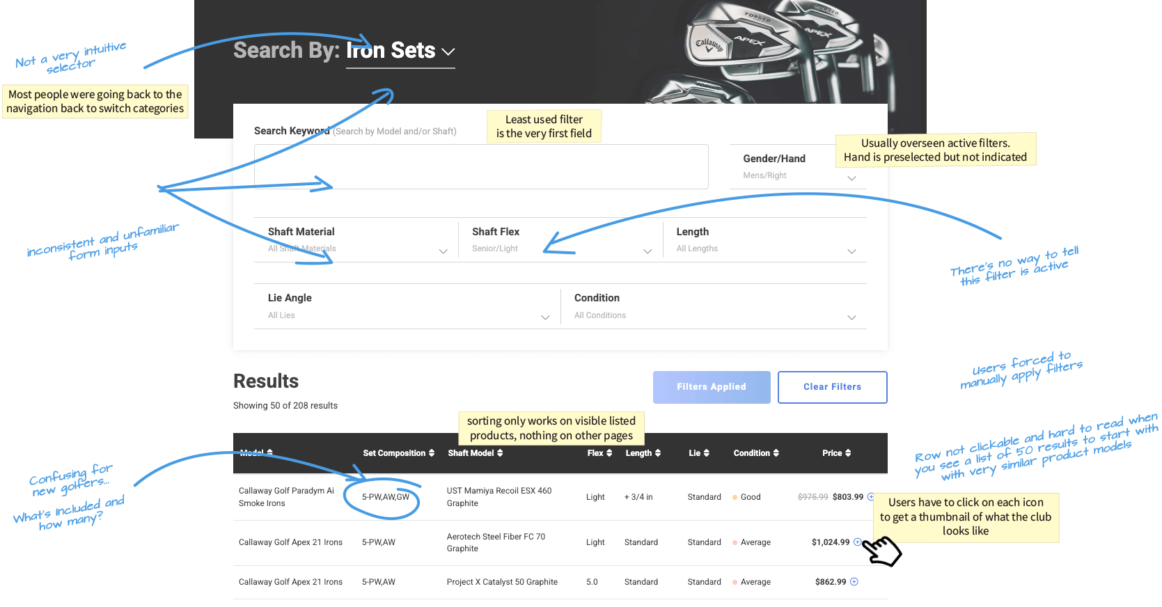
A. Category Selector (hard to notice)
The category entry point was easy to miss, which led to people leaving the tool to switch categories.
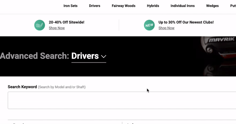 *Old category selector area that looked like a banner or secondary UI
B. Essential vs Nice-to-have Filters (not prioritized)
Filters were not prioritized. Some low-use filters took prime space, while more important filters were harder to find.
 *Old filter list showing long sections and weak grouping.
C. Lack of Clear Filter States and Tooltips
Filters did not clearly show what was selected. Also, some filter concepts needed simple tooltips (especially for more technical details).
 *Example showing unclear selected state, plus a tooltip mock.
D. Rows Were Hard to Scan
Rows were text-heavy and repetitive, which made it hard to compare products quickly.
 *Old grid rows with repeated text and small click targets (The "+" Sign).
E. Mobile Mess
Mobile had stacked problems:
- Filters were hidden by default
- Tiles felt long and hard to scan
- Similar items were not clearly grouped
- No quick way to get back up
- Less than 2 products fit well in the viewport
4. Strategy
We needed to move fast because we wanted results and a direction before the biggest shopping week of the year. The plan was to prove improvements quickly in Dynamic Yield, then hand off what worked for a permanent front-end build.
My strategy was: reduce friction first, then add clarity and confidence.
Phase 1.1: Starting with the Basics
To kick things off and iterate faster, I used a checklist approach to pressure-test the experience. I also used ChatGPT early on to generate a usability and accessibility checklist so I could quickly spot gaps and organize the work.
 Usability
- Are the filters easy to find and well-labeled?
- not really
- Do all filter options have clear, readable labels?
- kinda
- Are checkboxes large enough to interact with, even on mobile?
- yes
- Do applied filters update results dynamically or provide immediate feedback?
- nop
- Do the checkboxes have sufficient spacing to avoid accidental selections?
- for the most part
Accessibility
- Are filters accessible via keyboard navigation?
- some
- Are ARIA roles properly implemented for screen readers?
- nop
- Is there high color contrast for text and checkbox states (e.g., checked/unchecked)?
- yes
- Do all selected filters have a visual indicator (e.g., bold text, highlighted box)?
- nop
Design
- Are there visual indicators for filters that will return no results?
- none
- Is the design consistent with the rest of the interface (e.g., colors, typography)?
- they aren't
- Do filters work seamlessly across different devices (desktop, tablet, mobile)?
- no
- Do selected filters show a summary at the top of the results page?
- kinda
- re animations smooth and not distracting when filters are applied or reset?
- Nop
Performance & Content
- Does the interface support real-time updates without lag?
- I wish
- Does the filtering logic handle a large dataset without performance issues?
- no
- Are tooltips or examples available for filters that may be unclear?
- there aren't any
- Are groupings of related filters logical and easy to scan?
- unfortunately, no
- Is there a clear 'Clear All Filters' option available?
- YES!
Phase 1.2 - Inspiration
I reviewed patterns from strong retail filtering and category navigation experiences to see what “good” looks like for scanning, filtering, and switching categories fast.

Phase 1.3: Things to Fix ASAP
Based on the audit and research, the first “must fix” list was to make selected filters obvious (pills and active states), reorder filters so the most important ones show up first, make category switching impossible to miss, improve mobile browsing so filters and results feel manageable, improve grid readability and click targets, and add images (thumbnails) so scanning is faster.
Phase 2: Quick Testing (Dynamic Yield)
We focused on quick validation and Club Finder improvements before Black Friday and Cyber Monday.
I built the full first version in Dynamic Yield using HTML and CSS overrides (and kept it lightweight), then used the test results to support the permanent build handoff.
50/50 A/B test that ran for about 2 months.
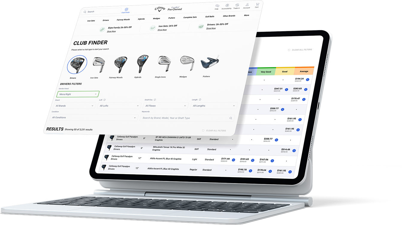
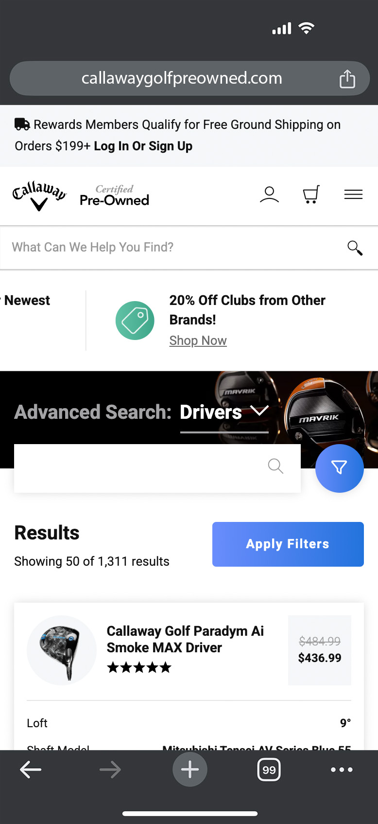
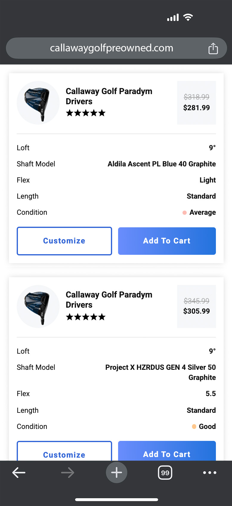
5. Final Design
I rallied my team to develop high-fidelity prototypes that brought our proposed restructure to life. Once prototypes were approved, we met one more time with all stakeholders to finalize a detailed roadmap and plan the necessary tests that my team and I would manage.
Desktop
Mobile

6. Results
We rolled out the solution in two steps. First, we focused on filters and categories: we made filters feel like real selectable controls instead of plain text, showed selected values as pills, highlighted filter areas when something was applied, reordered filters to prioritize the most useful ones, and made category switching a clear, visual selector that was hard to miss.
Second, we improved the grid. We added product thumbnails to make scanning faster, added tooltips for iron set configurations, and made the entire row clickable instead of relying on a small icon, so browsing and comparing clubs felt quicker and less frustrating.
+9.61%
ATC Rate (Desktop)
+10.81%
Order Conversion Value (Desktop)
+5.92
ATC Conversion Rate (Desktop)
+16.20
ATC Conversion Rate (Mobile)
| Mobile Metrics | v0 - Control (7.2K Sessions) |
v1 - Updated (6.8K Sessions) |
v1 | Stat Sig |
|---|---|---|---|---|
| Category Select Clicks | 14.96% | 24.05% | +60.81% | 99% |
| Filter Clicks | 44.43% | 50.17% | +12.91% | 99% |
| Learn More Click to PDP | 0.84% | 1.12% | +34.21% | 91% |
| Add to Cart | 9.72% | 10.66% | +9.61% | 93% |
| Overall Order Conversion | 3.66% | 4.05% | +10.81% | 77% |
| ATC Conversion | 16.50% | 17.48% | +5.92% | 87% |
| Desktop Metrics | v0 - Control (7.9K Sessions) |
v1 - Updated (8.2K Sessions) |
v1 | Stat Sig |
|---|---|---|---|---|
| Category Select Clicks | 20.24% | 34.47% | +70.33% | 99% |
| Filter Clicks | 74.38% | 75.12% | +0.99% | 72% |
| Learn More Click to PDP | 4.95% | 5.30% | +7.03% | 68% |
| Add to Cart | 8.87% | 9.12% | +2.77% | 41% |
| Overall Order Conversion | 4.66% | 5.02% | +7.69% | 71% |
| ATC Conversion | 20.94% | 24.33% | +16.20% | 99% |
Challenges
Mobile was the hardest part. Club Finder has a lot of filters and product info, and limited space can make everything feel overwhelming fast. Filters were also easy to miss, which made the tool feel harder than it needed to be.
The timeline was tight. We needed to ship and learn quickly so improvements could be live before Black Friday.
Grid work was more complex than it looked. Improving the grid meant cleaning up labels, adding tooltips, adding images, and making rows easier to click, without breaking the shopping flow.
Next Steps
After improving conversion, the next step was to bring more people into the tool.
Naming test (traffic)
We tested renaming Advanced Search to Club Finder. The assumption was that “Advanced Search” sounded intimidating, and “Club Finder” felt more friendly. Club Finder won, and it helped drive more clicks into the tool.
Consistency across shopping grids
Next, we made sure the grid patterns across Club Finder, product listing pages, and product detail pages looked and worked similarly, so customers did not have to relearn how to shop as they moved through the site.
Lessons and Reflections
Shipping a full first version in Dynamic Yield was a huge advantage. It let us move fast, test with real traffic, and prove what worked before we asked engineering to lock it in permanently.
The two-step rollout helped too. Doing filters and categories first, then the grid, kept the work focused and lowered the risk.
Clarity wins. When shoppers can quickly see what’s selected, what they’re looking at, and what the product is, conversion follows.
Visit The Live Version🏌️How's that for a hole-in-one?
If you're looking to achieve similar results and drive impactful design solutions, contact me, and let's tee off your next project together!